HOA Brand Identity & Community Experience
A strategic branding initiative that turned routine communication into opportunities for connection.
Role
Brand Strategy • Content Strategy • Website Strategy • Copywriting • Information Architecture • Creative Direction
The Challenge
The Association had an existing logo, but it existed primarily as a dated Word letterhead asset with no supporting brand standards or cohesive visual system. There was no website, inconsistent communication practices, and no clear identity guiding how the community presented itself to homeowners.
The challenge was to create a modern brand experience that honored the community's history while fostering a stronger sense of connection, approachability, and trust.
The Idea
What if an HOA felt less like an authority and more like a community?
The goal wasn't simply to redesign a logo or launch a website. It was to redefine how the Association communicated and presented itself through a more welcoming, human-centered identity system.
The Approach
I approached the project by first identifying the values the brand should communicate:
- Welcoming
- Community-focused
- Transparent
- Helpful
- Professional without being intimidating
These principles informed every aspect of the work, from logo refinements and color selection to messaging, website design, and future communication standards.
Key Decisions
Evolving an Existing Identity
Rather than starting from scratch, I modernized the existing logo to preserve community recognition while creating a more polished and approachable visual identity.
Establishing a Cohesive Visual System
I developed a primary and secondary color palette designed to bring warmth and consistency across digital and communication touchpoints.
Defining the Brand Voice
Communication standards were established to shift the Association's tone from formal and transactional to clear, welcoming, and community-oriented.
Extending the Brand Through Digital Experience
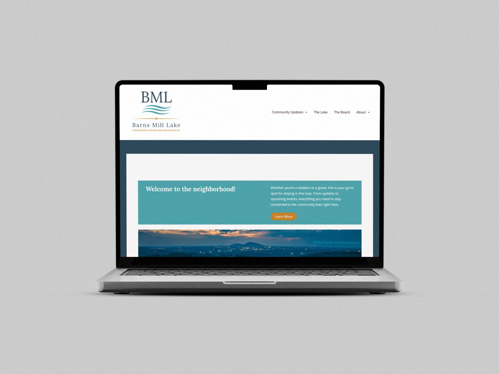
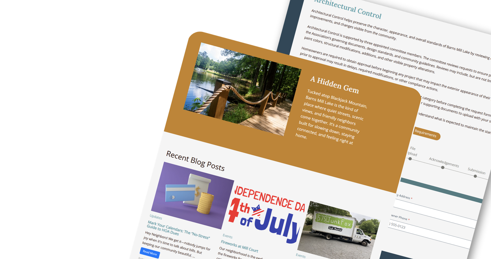
The newly established identity system informed the design and structure of the community's first website, creating a centralized resource that reflected the brand's values while improving access to information.
What I Focused On
- Brand identity evolution
- Logo modernization
- Color palette development
- Voice and tone guidelines
- Community-centered communication strategy
- Brand consistency across touchpoints
- Website implementation and experience design
Result
A set of visually distinct social ads—internally referred to as “the blue ads”—that stood out from typical campaign visuals and continued to perform well even after the product was no longer being actively promoted.
Before:

After:
The neighborhood includes both long-time residents and an emerging younger population, so the identity needed to feel familiar without feeling dated. I wanted to respect the community’s legacy while bringing the brand into the present.
The original mark functioned more like a letterhead graphic than a true logo, so I treated it as inspiration rather than a strict template. I kept the original dark blue as the primary color to preserve continuity and used the original gold as an accent color.
For the secondary color, I thought about the most prominent feature of the neighborhood: the lake. I chose a lighter blue to represent water while still pairing naturally with the primary dark blue. For the neutral palette, I selected a white, black, and gray that worked well with the full color system and supported a clean, flexible identity.

The original colors made sense for the way the Association used to communicate. Previous Boards mailed printed newsletters to the community, and the darker, more traditional palette worked well in that format. But by the time this project began, the Association had moved away from print and adopted email and the website as its primary communication channels.
While the first version of the expanded palette felt warm, friendly, and modern, it wasn’t as effective on screen. Since the new identity needed to function primarily in digital spaces, I adjusted the colors to better support web readability, accessibility, and consistency while preserving the warmth and familiarity of the original direction.

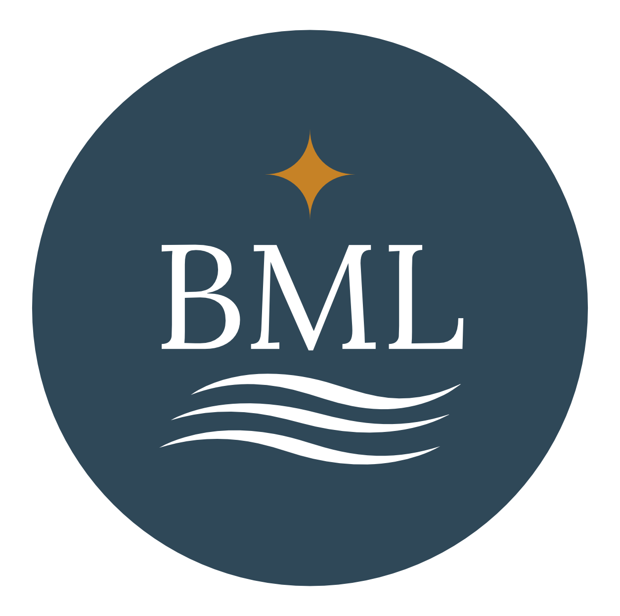
After establishing the color system, I explored several logo directions before landing on a monogram with the full community name underneath. This gave the identity a recognizable mark while keeping the name clear and accessible.
Lora became the primary typeface because it struck the right balance between classic and contemporary. That mix felt appropriate for a neighborhood with both long-time residents and a newer generation of homeowners. It feels warm, elegant, and trustworthy without becoming too formal.
For the accent typeface, I chose Open Sans. It is clean, friendly, and highly legible across screen sizes, which was especially important with a website project ahead. Together, Lora and Open Sans helped create a brand voice that feels welcoming, trustworthy, and unmistakably Barns Mill Lake.
The monogram direction was strong, but I was still drawn to the idea of a standalone logomark. Because I was developing the brand with the website in mind, I knew the system would need a simple graphic element that could work in smaller applications, such as a favicon or other spaces where the full wordmark would lose legibility.
I returned to the lake as the most natural source of inspiration. Since the icon needed to remain clear at very small sizes, I explored several vector-style line treatments that could be easily recognized as stylized water. Once I landed on the final mark, I used elements from the full logo system to create secondary logo variations for different applications.


My favorite direction was the first option, but it didn’t solve the main problem. The secondary logo needed to work as a website favicon, and while the design wasn’t visually busy at a larger size, it lost clarity at 16x16 and 32x32 pixels.
The second option had a different set of issues. The lines became too thin to read at small sizes, and the shape started to feel too similar to the Spotify logo. Since this was a brand-new identity system, I was also concerned that residents would not immediately connect it back to Barns Mill Lake.
That left the final icon. It performed the best at small sizes, but it still had readability challenges. To make it work, I had to bend one of the usual design rules and reduce the negative space more than I normally would. In this case, function mattered most. The icon below is the version currently used across the website.

This project reinforced my belief that effective branding is about more than aesthetics. While the website became the most visible outcome, the real success was creating a flexible identity system that reflects the community, supports clearer communication, and can evolve alongside the people it serves.
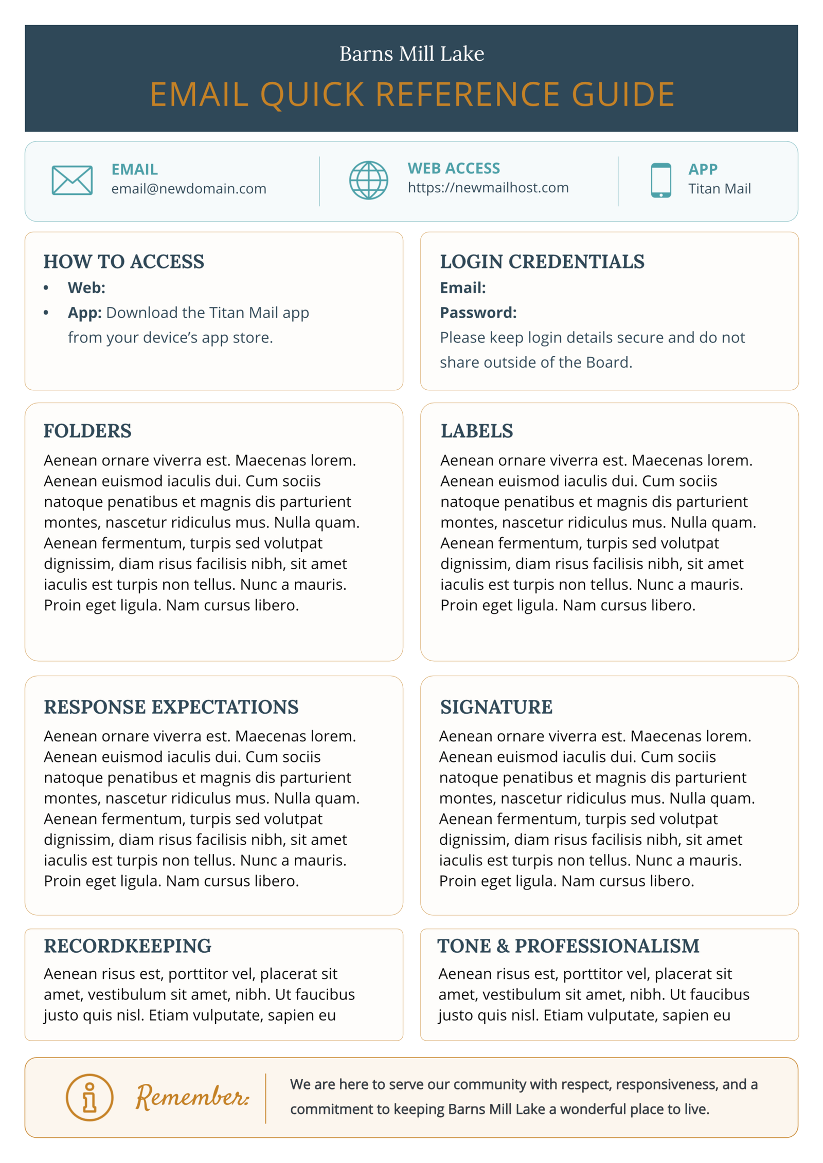
In addition to the website, we also implemented a new email system. I created a quick start guide for the rest of the Board to help them get started.