Go Modular!
Social ad designs built to stop the scroll and communicate a modular concept instantly.

Role
Graphic Designer
The Challenge
Communicate a modular product concept in a way that felt clear and intuitive—something people could understand quickly in a fast-moving environment like social media.
At the same time, our ads had started to feel visually similar, so there was a risk of them blending in instead of standing out.
The Idea
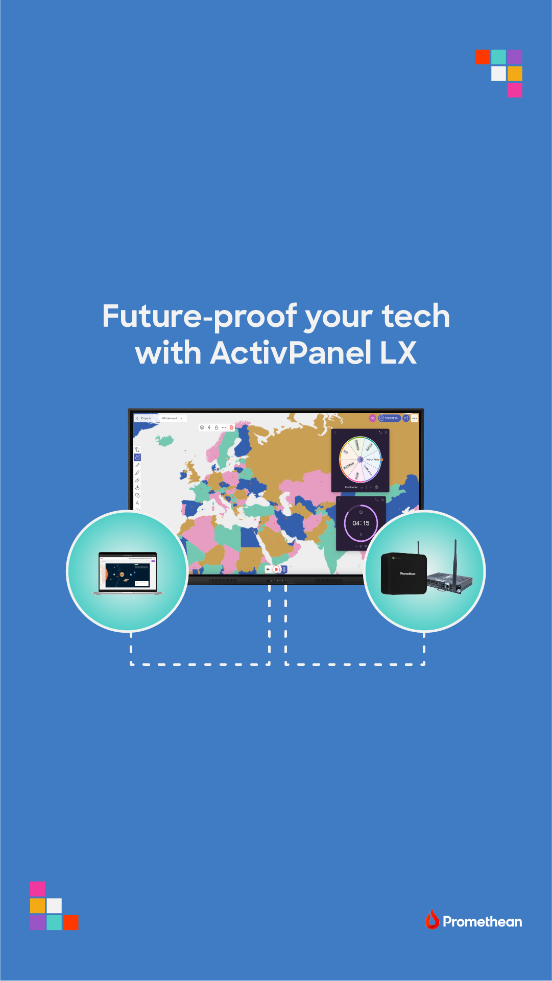
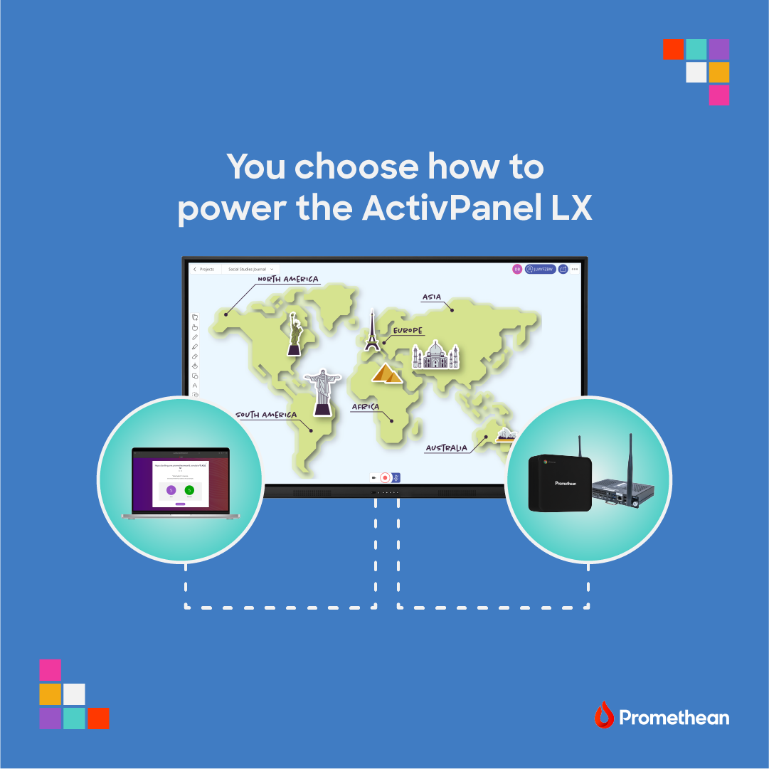
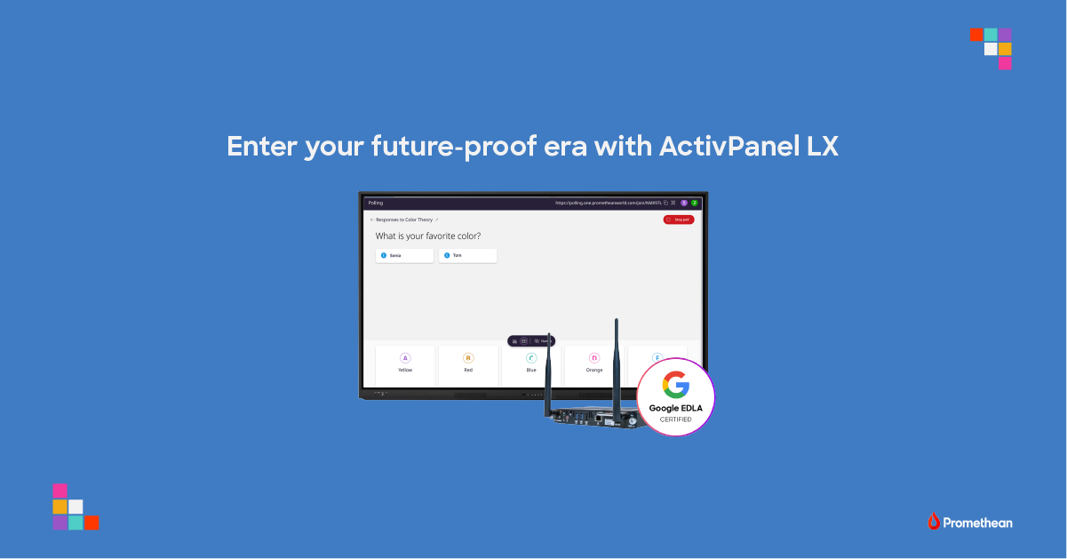
The concept itself—modularity—became the design system.
Instead of just explaining it, I focused on visually reinforcing it through structure: breaking elements into pieces and showing how they connect and build into something larger.
To help the ads stand out, I also leaned into the brighter secondary color palette, using bold blues to create contrast against our more traditional dark brand visuals.
The Approach
I designed a clean, structured layout system that mirrors the idea of modularity—using repetition, alignment, and spacing to create a sense of order and flexibility.
Because these were social ads, everything was built to be quick to read, visually distinct, and easy to adapt across variations.
Key Decisions
- Use grid-based layouts to reflect structure and consistency
- Repeat visual elements to reinforce the modular concept
- Leverage a brighter secondary color palette to break from traditional brand visuals
- Design for quick readability and impact in a scrolling environment
What I Focused On
- Making a conceptual idea feel immediate and visual
- Creating designs that stand out from existing campaign styles
- Building a system that could be reused and adapted easily
Result
A set of visually distinct social ads—internally referred to as “the blue ads”—that stood out from typical campaign visuals and continued to perform well even after the product was no longer being actively promoted.